2025 Design Trends That Move the Needle
2025 design trends are only useful if they serve the message. The right choices amplify clarity, help customers “get it” faster, and make your brand feel current without chasing every shiny object. Below are the current design trends worth your time in 2025, plus practical ways to use them.
1) Bold minimalism
Clean compositions with one unexpected punch—oversized type, a striking accent, or asymmetric whitespace—are replacing clutter. It’s confident and conversion-friendly on the web and mobile.
Use it: pick one focal element per screen; let everything else support the action.
2) Tactile textures, metallics, and grain
Soft grain, brushed metal, and subtle noise give digital surfaces warmth. Used lightly, these cues add depth without slowing pages.
Use it: apply micro-grain to hero backgrounds and cards; keep contrast ratios accessible.
3) Pixel & neo-retro moments
Pixel art, early-web cues, and chunky UI elements are back—as accents. They spark nostalgia and scroll-stopping personality when balanced with modern type and spacing.
Use it: reserve retro for campaign visuals, not entire UI systems.
4) Kinetic type & micro-interactions
Small, purposeful motion—button ripples, progress ticks, kinetic headlines—guides attention and communicates state changes. The goal is clarity first, delight second.
Use it: set motion rules (duration, easing, when/why it moves) and test on low-power devices.
5) Social-first visual systems
Short video, vertical framing, on-screen captions, and thumbnail-savvy type are the default for discovery in 2025. Design systems now include social patterns alongside web and print.
Use it: for each campaign, make a 9:16 hero, a 1:1 cutdown, and closed-caption files.
6) Variable and responsive logos
Logo families that scale from storefront to favicon—sometimes with animated or condensed cuts—perform best across devices and channels.
Use it: deliver a logo kit with size tiers, motion rules, and legibility tests at 16–24px.
7) AR & spatial touchpoints
From product try-ons to event signage, AR overlays are moving into mainstream campaigns. Even simple web-AR filters can boost interaction time and earned media.
Use it: start with one shoppable AR scene or an event-only filter; track dwell time and shares.
8) Mobile-first UX as the ranking standard
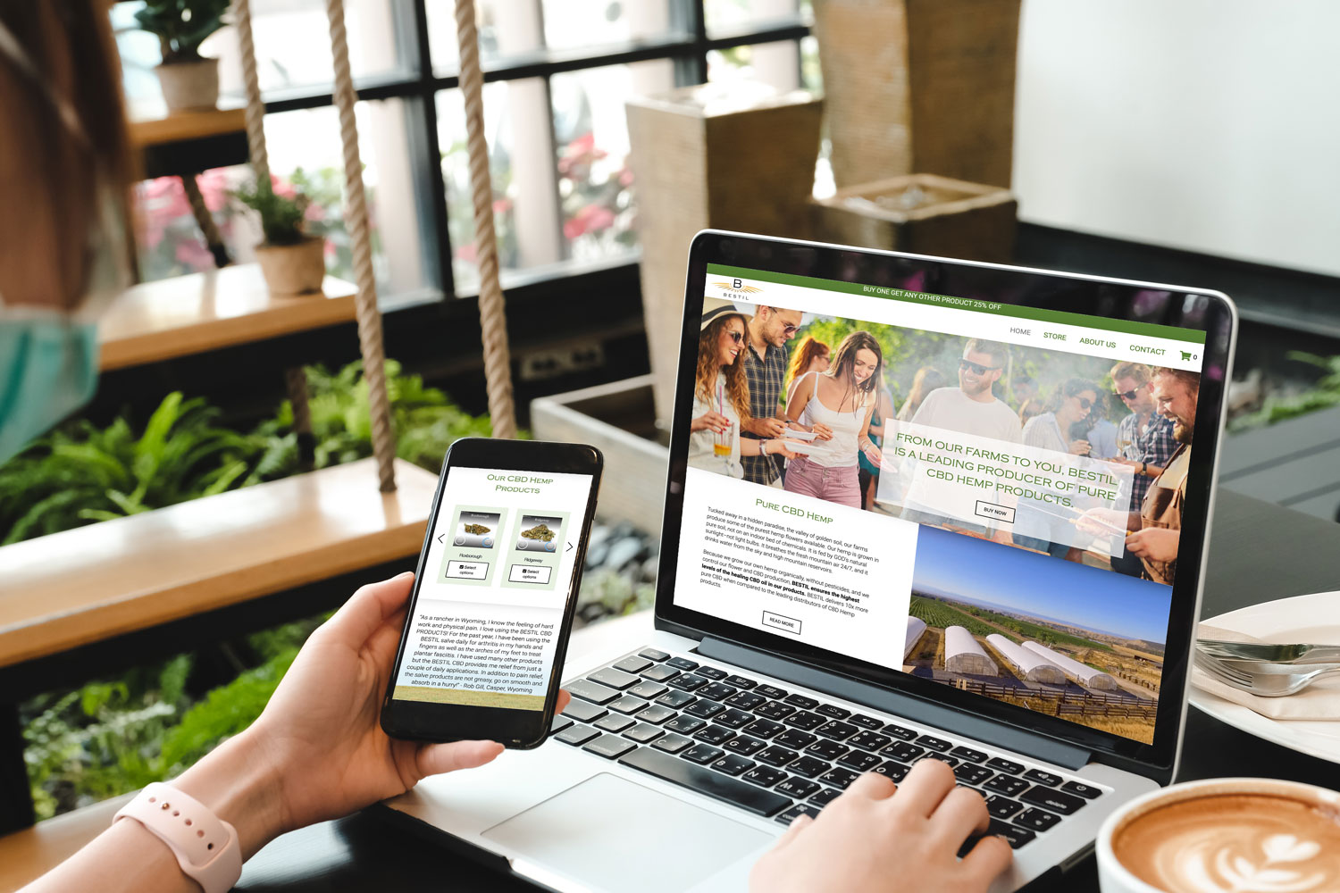
Google indexes and ranks primarily from your mobile experience. Typography, tap targets, performance, and parity with desktop content all impact visibility and conversion.
Use it: audit mobile first: headings hierarchy, CLS under 0.1, and identical primary content to desktop.
9) Accessibility as craft
High-contrast palettes, focus states, meaningful link styles, and motion-reduction toggles are now table stakes—good design is inclusive design. Bonus: it also improves SEO and conversion.
Use it: build an a11y checklist into design QA; test with screen readers and prefers-reduced-motion.
Quick implementation checklist
-
Pick two trends that map to your goal, for example micro-interactions for conversion or social-first for reach.
-
Produce one mobile-first page/component and validate performance + accessibility.
-
Create a responsive logo kit and vertical video template.
-
Pilot one AR touchpoint for your next launch.
Want a 30-day design sprint?
We’ll turn these trends into a practical, brand-safe system: social-first templates, motion rules, a responsive logo kit, and a mobile-performance tune-up.
→ Book a 20-minute strategy call
Prefer email? [email protected]

