TMS Self-Storage
A year before construction began, DC worked with the development team to create a logo that communicated an important marketing point of the location. The facility is out in a newer, developing area of Dallas/Fort Worth, and it is at the crossroads of the 114 and 156 highways. We played with that important location and turned the T of TMS into a crossroads. The color palette we chose was selected from the architectural renderings of the project.
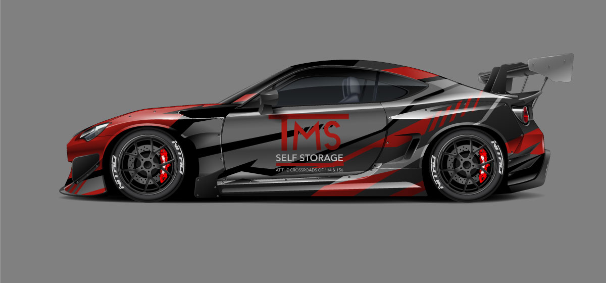
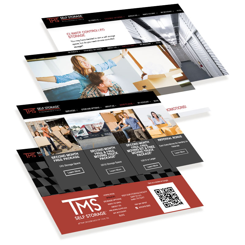
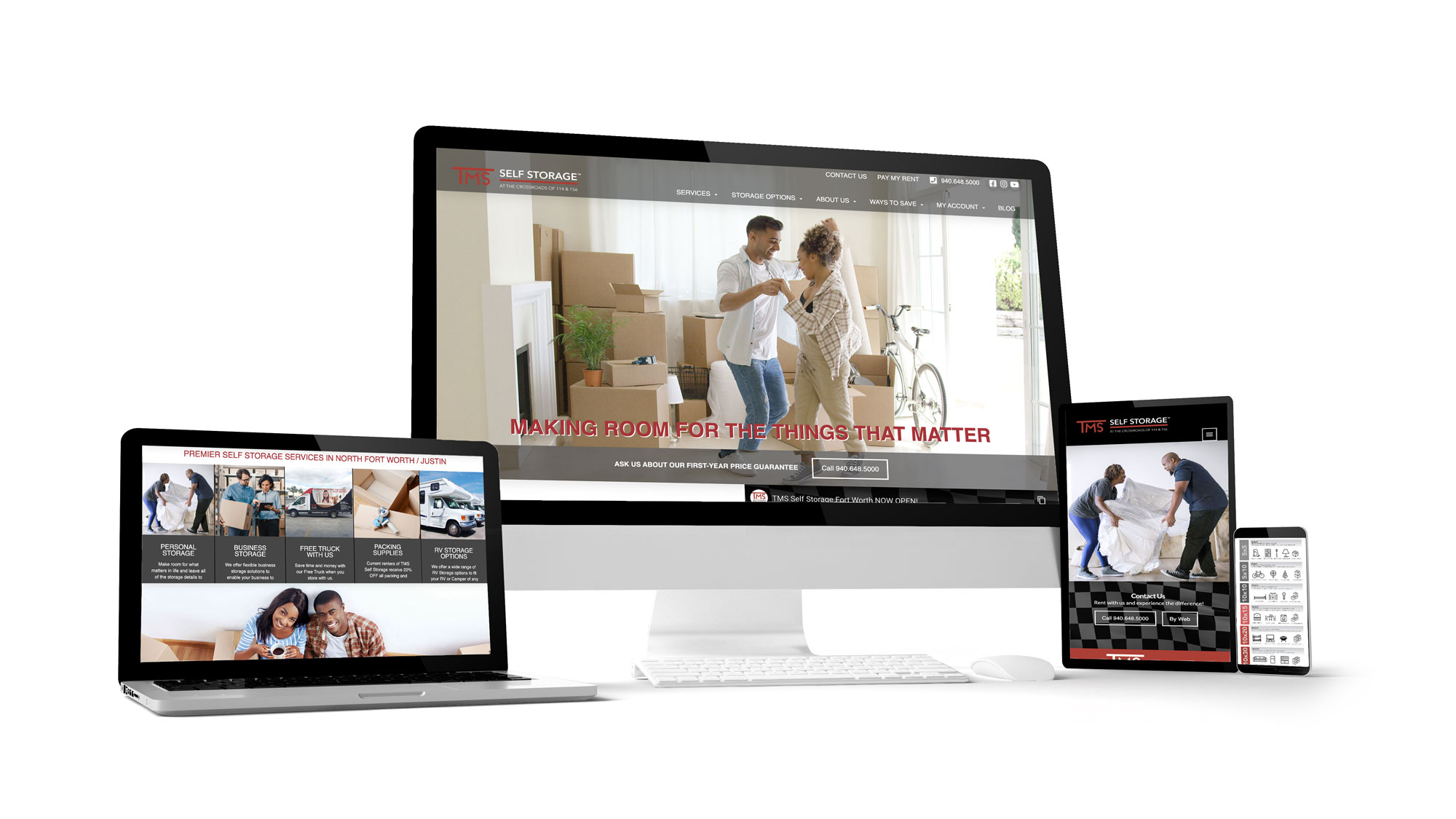
The website design follows from the logo and facility design. The website uses a lot of black and is crisp, clean and modern, just TMS itself. You look at the website and you get a feel for the beautiful structure itself, with a touch of personal and local. The site features a video on the home page that accents the storage facility distinctives and lays out all of the benefits of renting storage from TMS. The branding on the website and in marketing pieces, includes the racing flags of the nearby Texas Motor Speedway to give customers a handle on remembering TMS Self Storage from among the competition and help customers find TMS easily.
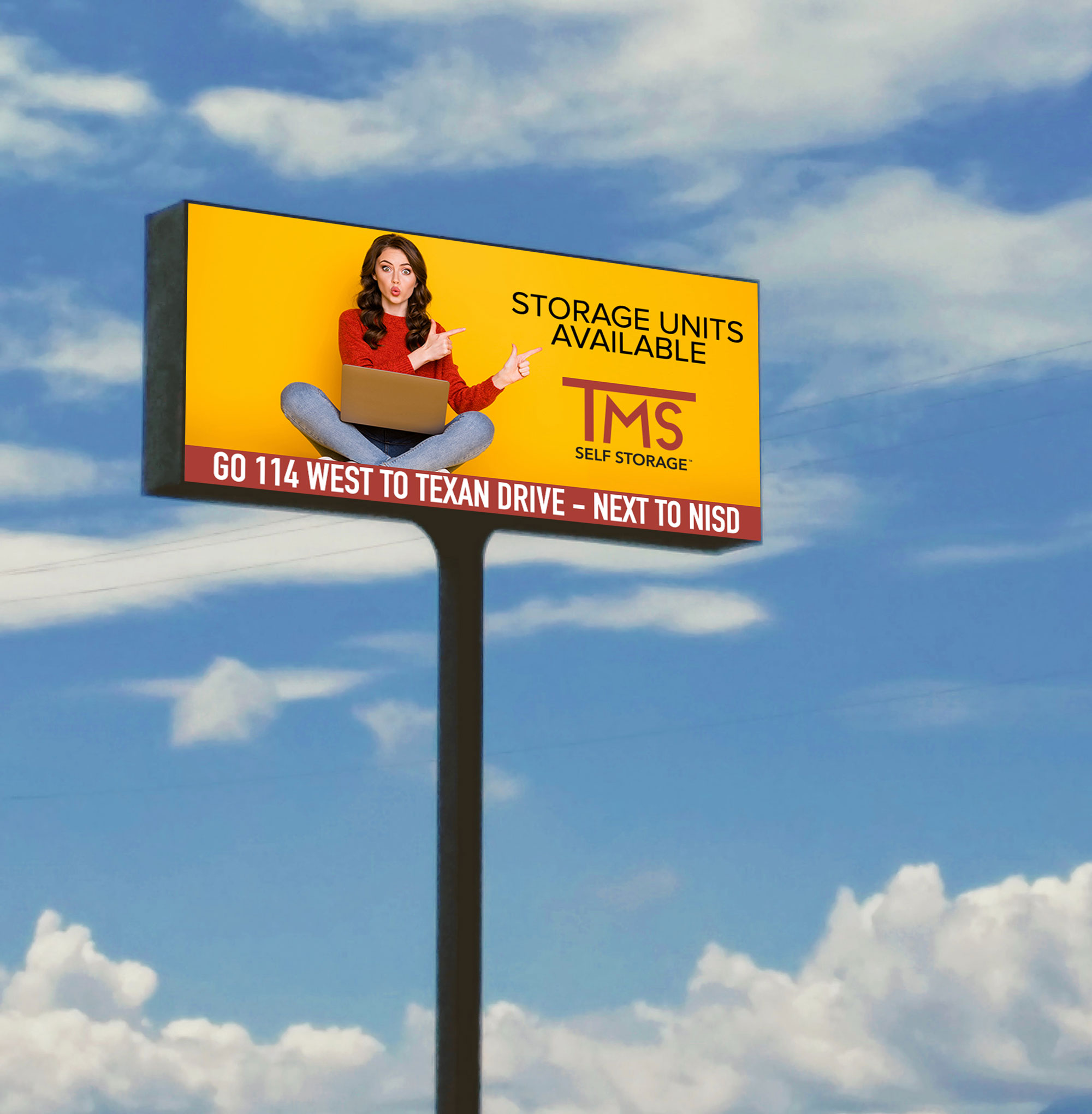
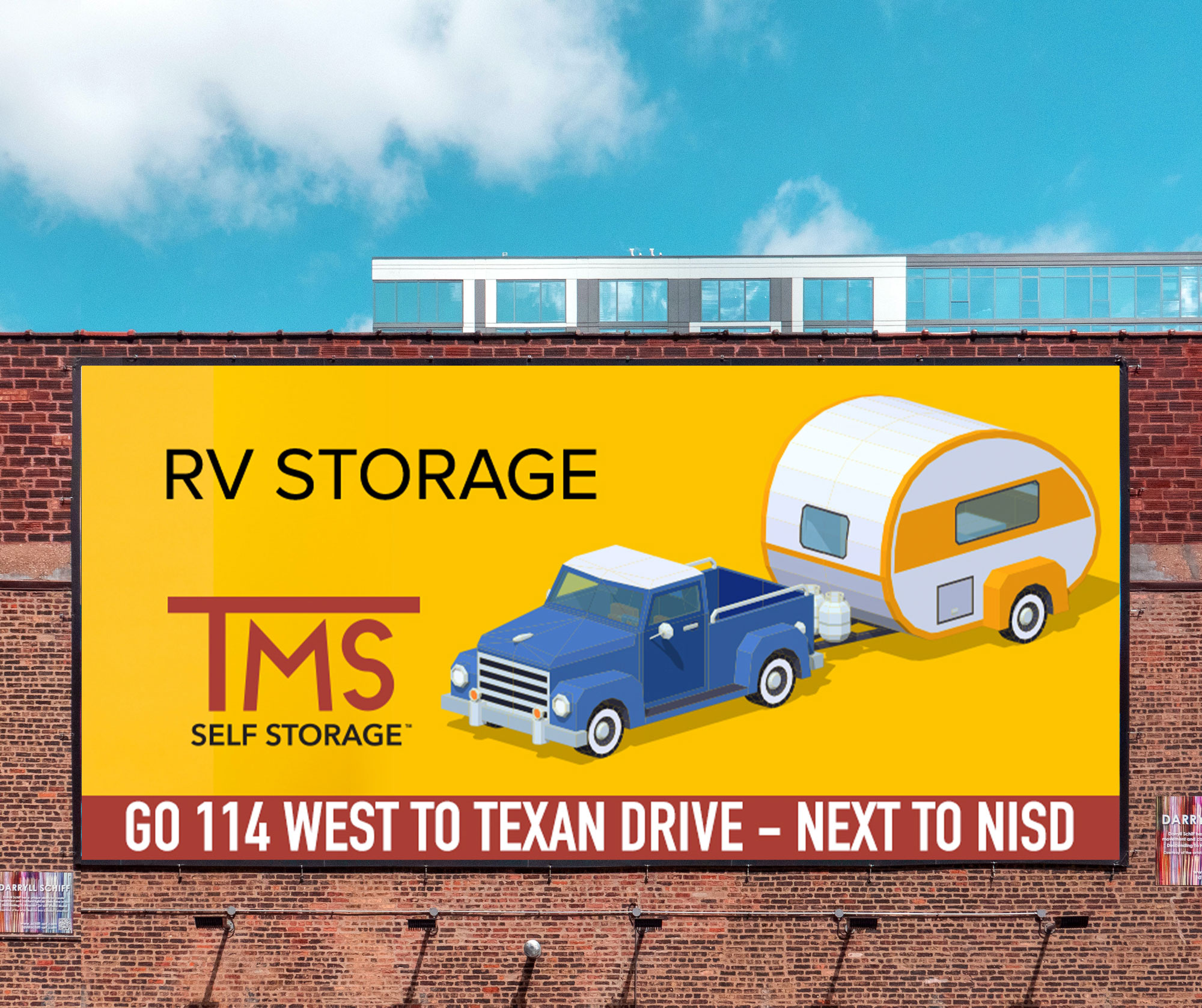
Marketing for this new storage facility includes a robust social media marketing strategy, Google Adwords campaign and billboard advertising. The large facility has exceeded sales expectations in spite of opening during the Coronavirus, and the developer began developing the second phase earlier than the expected schedule.
Branding

Web Design
Graphic Design & Print
