Williams & Kunkel CPAs
In updating the brand, we started with redesigning the logo using a classic serif font but implementing the stylish ampersand in the logo to show these are not stodgy accountants. In the color palette for the logo, we chose a charcoal blue/grey to ground the firm in a modern way and colorized the stylish ampersand with a vibrant aquamarine to communicate the energy of the firm and its leader.
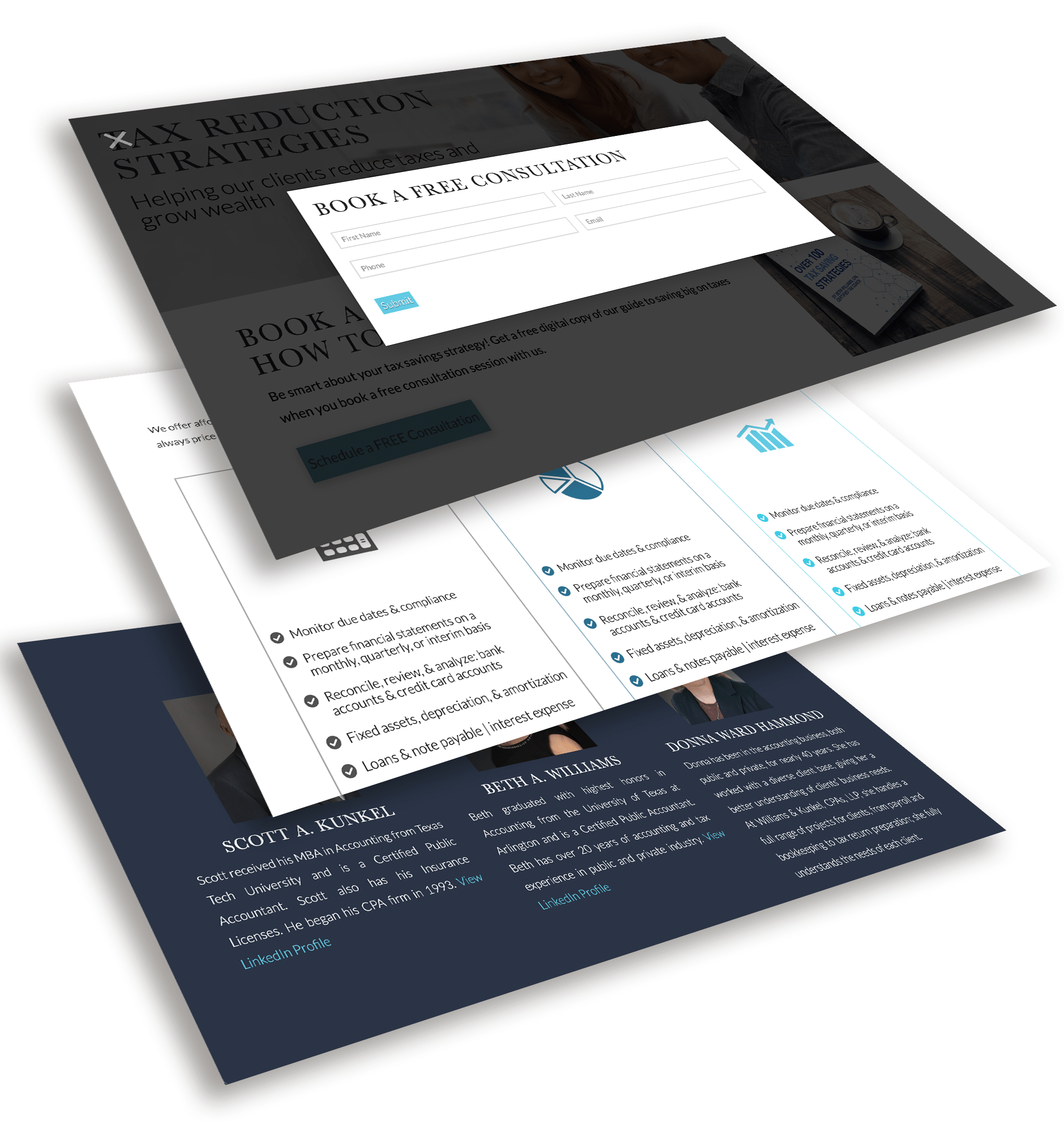
In the website redesign, the landing page includes a slider that reveals the main services of the company. Below the slider is a giveaway of a free digital copy of William & Kunkel's guide to tax savings when you book a free consultation. The goal here is to capture a potential customer’s name, phone, and email in return for a free consultation where a W&K team member meets with the potential customer and closes the sale. The site features downloadable giveaways, call-to-action lead buttons, a robust blog section, and an extensive resource section with financial calculators.
Branding

Web Design

Search Engine Optimization


