
800.646.1387

Web Design
What is Responsive Web Design?
Many of our customers know they need responsive web design, thanks to ads like the one above that predicted the end of the world if a site wasn’t mobile responsive. Yet, many really don’t understand why responsive web design is so important. Frankly, it comes down to business growth or loss.
What Is Responsive Web Design?

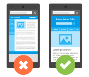
Responsive design serves all devices
with the same code that adjusts for screen size.
Responsive web design (RWD) is a setup where the server always sends the same HTML code to all devices, and CSS (Cascading Style Sheets. CSS describes how HTML elements are to be displayed on screen) is used to alter the rendering of the page on the device. RWD responds to a user’s behavior and environment based on screen size, platform and orientation.
The practice consists of a mix of flexible grids and layouts, images and an intelligent use of CSS media queries. As the user switches from their laptop to iPad, the website automatically switches to accommodate for resolution, image size and scripting abilities.
Responsive Web Design Reduces Load Time
The advantage of RWD is that it eliminates the need for a different design and development for various sizes of screens, and this affects the load time of a page.
When the server always sends the same HTML code to all devices, and CSS is used to alter the rendering of the page on the device, Google can more quickly scan a website. Google’s algorithms automatically detect this setup, and Googlebots crawl the page more quickly and the page loads faster. Rather than redirecting users to a different device-optimized view, any screen size will load automatically based on the CSS code for each screen size.
Responsive Web Design Helps Google Crawl More of Your Site
Google tells us that RWD saves resources when a Googlebot crawls your site. For Responsive Web Design pages, a single Googlebot user agent only needs to crawl your page once, rather than crawling multiple times with different Googlebot user agents to retrieve all versions of the content. This improvement in crawling efficiency can indirectly help Google index more of your site’s content and keep it appropriately fresh. When Google can crawl more of your site, it also indexes more of your content for people to find you.
Responsive Web Design Improves Your Site Rank
Google gives mobile-optimized sites precedence when searching on mobile devices. If your site isn’t easy to use on mobile, Google penalizes it by ranking it lower on its mobile search results pages. Google is responding to the increasing growth of mobile users, and they will serve mobile responsive websites first. To give publishers even more of an incentive to offer mobile-friendly pages, Google makes it very clear on their website that they will increase the importance of having a mobile page, and sites that are not mobile-friendly will rank even lower than before.