The Number 1 Way to Increase Conversion Rate
Many customers ask how they might increase conversion rate on their website. And while many options exist, we often recommend that we develop a simple website pop up to increase conversion rate.
-
Website Pop Ups Increase Conversion Rate
First things first: you need a pop-up on your website. Depending on the type of website you have: WordPress, Shopify, Wix, or Squarespace, plenty of plugins and options exist on the market. In fact, so many options exist out on the marketplace, you may want to simply ask the recommendation of your web-developer and hire them to develop the perfect website pop up for you. Website pop-ups can serve a variety of purposes depending on your call to action. They can grow your email list, bolster your sales, get clients chatting with you, or build brand authority. Follow some of the guidelines below to help build a successful website pop up to increase conversion rate.
-
Less Is More
When creating your pop up, keep it to as few boxes as possible. You want to keep it simple for your users and potential clients. If you’re collecting emails or asking them to sign up for something, keep it to two boxes “name” and “email.” You want the opt-in process to be simple, painless, and with the least number of barriers possible. If you’re trying to get them to click something, keep it to one button, no form to fill out. The simpler it is, the more likely a visitor will fill it out, and thus increase conversion rate.
-
Use Action Verbs
The purpose of your pop-up is to get your user to take action on something. Using action verbs will put allow your users to write themselves into the narrative of what you are asking them to do. Use words like, “click,” “join,” “learn,” “choose,” “support,” “take.” The power of suggestion can go a long way when asking people to engage with your content. Use words that will inspire the action you want them to take.
-
Pay Attention to Headlines
Often when people see a pop up they rush to click out of it as soon as possible. However, if you can make the image or the headline catch their attention, you may get them to stay on the pop-up and read what you’re offering. When creating your pop-up think of what your potential client wants to hear. Are you giving a discount? Asking them to sign up for something? The deal has to be sweet for them to want to give you their email or their money. Choose an eye-catching image and a headline that your customers want to read to get their attention and keep them on your page longer!
-
Include Strong Calls to Action
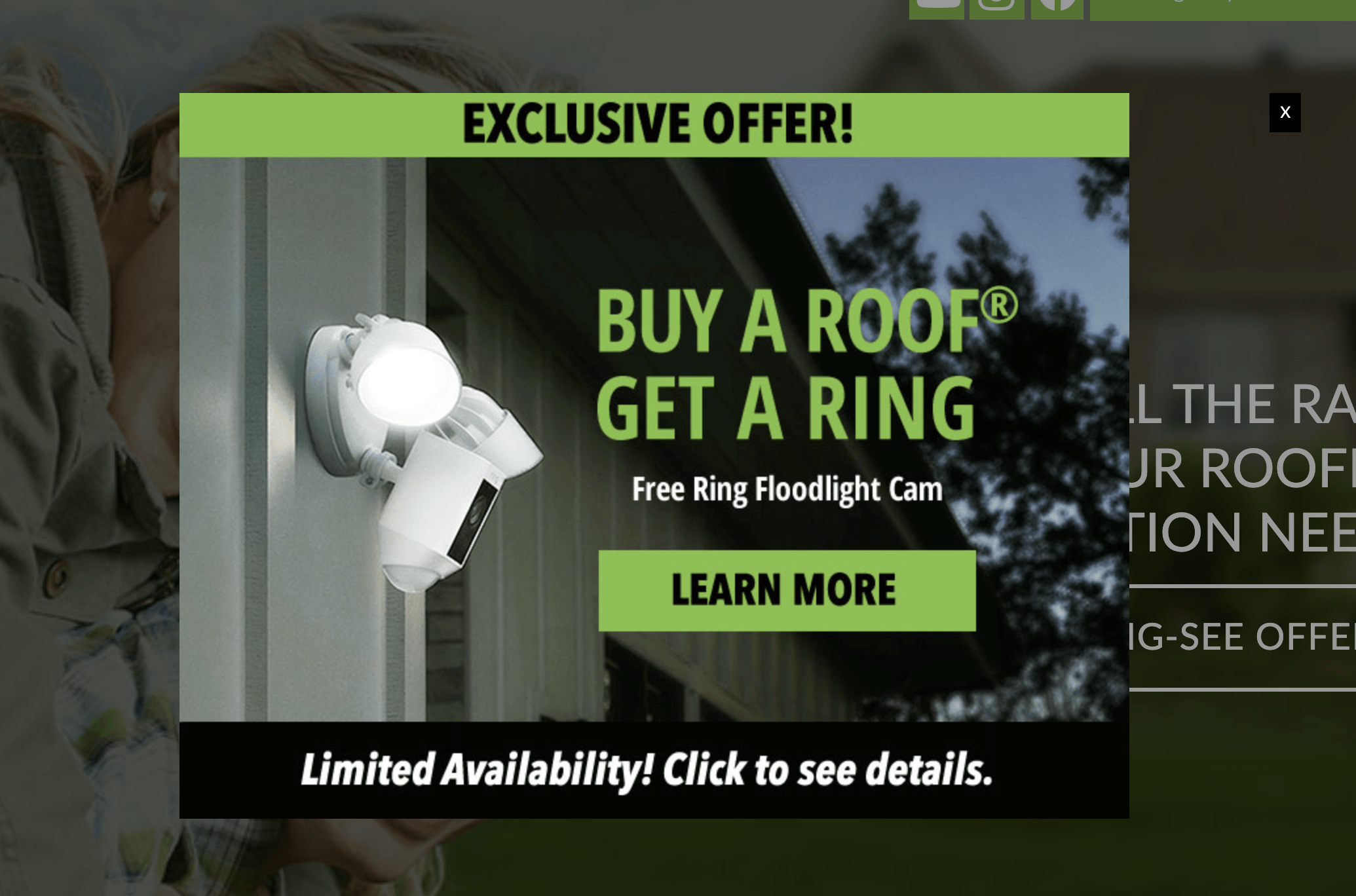
In addition to action verbs, your pop-up should get the user to do something, that’s the whole reason it’s there. If you’re trying to capture more emails, include a call to action like, “Join the Club,” or “Click to Subscribe.” If you’re offering your clients a deal or a special promotion include it in your headline. Make sure that the numbers of the promotion are upfront in the headline, make your call to action, “Shop Now,” or “Click! Don’t Miss this Limited Time Deal” Make sure you’re urging them to do something in your call to action, you will lose so many potential customers by skipping the call to action. Tell your clients what you want them to do.
-
Tell Visitors What They Are Going to Get
The pop-up must be mutually beneficial for your client if you are getting their email, their money, their time (whatever you’re hoping to get). In order to get what you want from your potential client, you have to give them something you think they will want. Perhaps it’s a discount on your products or services, maybe is a free sample of something; it could be a free download or member-exclusive discounts. It has to be interesting enough for them to relinquish their time, money, or email address. Tell them up front, in the headline what you are offering them.
-
Use Buttons Rather Than Links
People are more likely to click on a button that has a call to action rather than hyperlinked text. Buttons are larger, more visible, and catch the eye more readily than linked text. People are likely to overlook hyperlinks or linked text. A button is a great place for a call to action after you given your offering in the headline. Tell them the action you want them to take in the button.
-
Redirect After Opt-In
Make sure once they have taken action on your pop up, you redirect them to the page with the benefits. If they’ve clicked a call to action for a discount, redirect them to a page where they can purchase the product at that discounted rate. If they signed up for your email list, redirect them to a page where you are giving them something in return. Make sure that there is follow through with your pop up to give your user what you promised them.
-
Use Readable Fonts
This should be fairly obvious, but when it comes to pop ups, try to stay away from cursive or script fonts. Most people will not take the time to try and read what the fancy script says.
Those are some basic tips on getting started with making a pop up that keeps users on your website and gets them to click and convert. To learn more about website conversions, read our blog on using “Call to Actions to Lead to Conversions.” If you have questions, feel free to call our office at 800.646.1387 or reach us online by clicking our button below.


