3 Tips to Creating Websites That Convert
Now more than ever before, websites that convert should be at the top of everyone’s mind. Due to the coronavirus and its effect on the world, the trend moving forward to have a strong online presence has only been escalated. But what is the magic that turns casual users into serious consumers? How do we get our viewers to convert? Here we are addressing three of the biggest tips that keep customers on websites longer and convert them into buy clients.
Let’s use Senior Placement of Denver as the example of a website that converts. What do you think?
Websites that convert use attractive web design
A website is like a first impression. In fact, people are statistically more likely to “meet” your business online, long before they ever meet you in person, and over 60% of them will see your website on their phone first. Just like meeting someone for the first time in person, within fractions of a second you’ve already made snap decisions about who they are and whether or not you think you’ll get along with them. A website is no different. Within three seconds of someone landing on your website, they have already made the decision if they have positive or negative feelings about your company and whether or not they’d consider working with you.
A. Visual Cues –
What goes into that snap decision? Most of the time people are responding to quick visual cues and the words that are jumping out at them. The webpage needs to clearly communicate the product or service being offered. This is conveyed through pictures. Pictures with people’s faces in them are more likely to keep people on a website.
Attractive web design is communicated through the use of colors, and fonts. Do the colors and fonts add to the message you’re trying to visually convey to potential customers about your product? Some market research is necessary to determine this.
B. Fast Speed –
If your website takes longer than three seconds to load, over 60% of people will “bounce” or close your website tab. Speed is essential to keeping potential customers on your website. If your website is slow or takes a long time for images to load, it communicates a lack of professionalism to your users, and it wastes their time. Why should they wait for your website to load, when they can probably find one of your competitor’s websites that will get them the products and services they want without having to wait. Slow websites kill conversion.
C. Responsive Design –
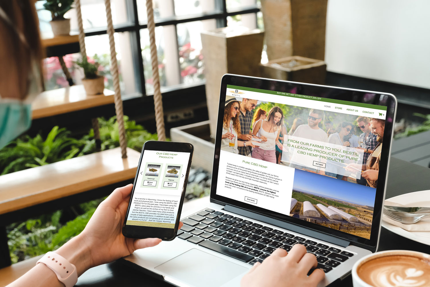
Have you tested your website on every device – every screen size from super small, old iPhones, to large tablets? How does it look? Statistics show us mobile web use is higher than desktop usage. More people are using their phones to search, shop, and engage than any other device. If your website is not optimized for every screen size, users might land on your website and not be able to see anything or see that is all out of whack and difficult to use. The more challenging or unoptimized a site is for mobile, the more people will walk away from your site and go to a competitor.
Websites that convert state clear value propositions
Highly converting websites tell visitors immediately what their company is about and what makes their products and services unique. The more your visitors know what your company does upfront, the more visitors understand and will feel like they can make informed purchasing decisions.
Websites that convert also identify clearly their business, products, or services. The client does not have to guess, hunt, or search for answers regarding your offerings. The less time a potential client has to spend trying to figure out if you can help them, the sooner you can move them to make purchasing decisions.
Websites that convert use friendly, “non-irritating” call-to-action buttons
Visitors convert best when they know what it is that you want them to do. That’s why websites that convert make use of calls-to-action (CTAs). Place CTA’s throughout your website. At every point where someone scrolls there should be an option to either learn more about your product or to purchase it. People instinctively want to push buttons. Give them lots of options to click! CTA buttons make it easy for your customers to connect with you.
A user may like what your selling – make it easy for them to connect. In other words, because there’s no CTA button, interested users won’t know how to take the next step towards conversion.
Display early, but not too much. The best converting websites display their CTA buttons early on and give visitors plenty of opportunities to convert. CTA buttons help guide users to the next step, whether that step is to check out a pricing page or convert.
Change the button text. Analytics show the actual words on the button affect whether the user will select it. You could set up a page containing several CTA buttons such as:
- Sign up
- Shop
- Subscribe
- Learn more
- Get started
- Claim Yours
Is your website generating online sales for you? If not, send us your URL and we will test your website speed on all browsers, check it on all screen sizes and see how it stacks up against your competition! Getting all of these pieces in place can be challenging. You may be asking, “How do I even fix site speed?” or “My website needs to be optimized for every screen size? How do I do that?”
Don’t worry about that! You focus on your incredible products and services; we will handle getting your website in top-selling performance.


